Upload two letters. Download a font you can install. Between those two steps sits a diffusion model that has to invent ninety-two characters it has never seen, and a pipeline that turns pixels into real outlines.
The architecture

The pipeline
A LoRA over FLUX.2-klein-9B, INT8-quantized to fit a single consumer GPU, trained on 923 typefaces. The choice that makes the rest work is the representation: a typeface is handled as one image, a 12×8 grid of glyphs, so a single diffusion pass produces the whole set with consistent weight and proportion rather than 94 separate generations that drift apart.
Then the part that makes it a font rather than a picture of one. Each cell is cut out and vectorized through Potrace into cubic Bézier outlines, the curves are fitted into glyph charstrings, and fontTools assembles them into a real OTF and WOFF2. The web app hands both back as downloads. What comes out installs in the OS and types.
Choosing the one that ships
Generation is stochastic, so the system samples several seeds per typeface and scores every cell of every candidate against ground truth before picking one.
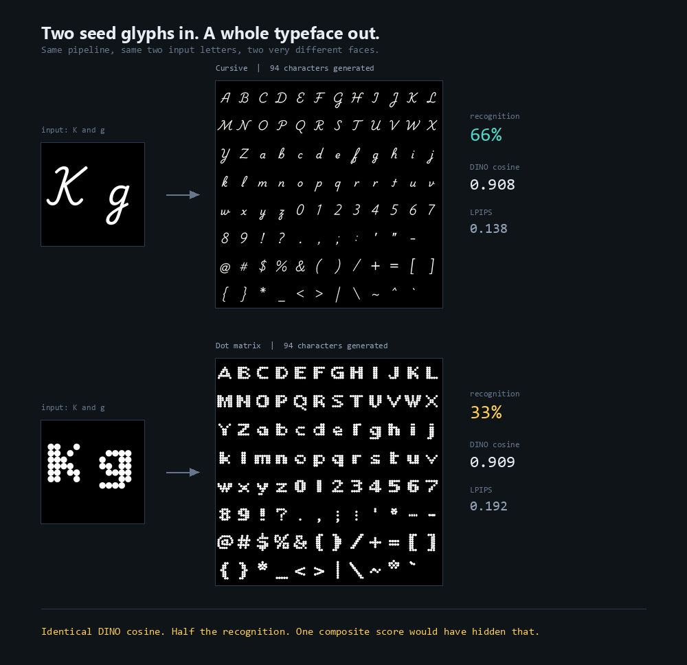
Three of those metrics are standard. The fourth was built here, because the standard ones share a blind spot: a dot-grid or distressed face rendered as a smooth solid blob reads as close to both a perceptual and an embedding metric, while being obviously wrong to a designer. The topology penalty scores the change in ink density and in count of connected components, so texture that gets quietly smoothed away is caught and penalised. The dot-matrix face above is exactly that failure mode, which is why it survives on embedding distance and collapses on recognition.
One more reproducibility fix earned its place in the pipeline: variable fonts rasterize differently across FreeType versions depending on table order, so every face is pinned to an explicit instance before rendering. Without it, ground truth itself moves between runs.
Ken Faiman · Applied AI, agent & evaluation systems · faiman.com